Interview with Flickerframe Shutter Festival Developers Part 2

Interview with Flickerframe Shutter Festival Developers Part 2

Continuation of Part 1.
Behind the Scenes of Flickerframe Shutter Festival
-Developer Ryann was kind enough to show us some in-development images and assets from the game, Ryann, could you tell us a bit about the images you shared?
Ryann : Yes, of course!
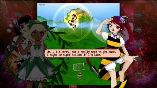
This first image is one of the first few screenshots of the game in a somewhat presentable state. You can see there’s a bunch of assets that were changed from this to the final version. Namely, you can see the dialogue bubble is wholly different (in design, size, and font), the character expressions are also different (different “emotion symbols”), the stage background, the HUD backdrop design, etc, etc. This screenshot was taken on March 25th, the same month the game started development. Very early.
If you guessed that a lot of the game had changed during development, to be honest, not much did. Generally, most of the final assets (as in, assets that are present in the released version) stopped being changed around April-May, and the rest of the assets were used as their first iteration, without being remade later.
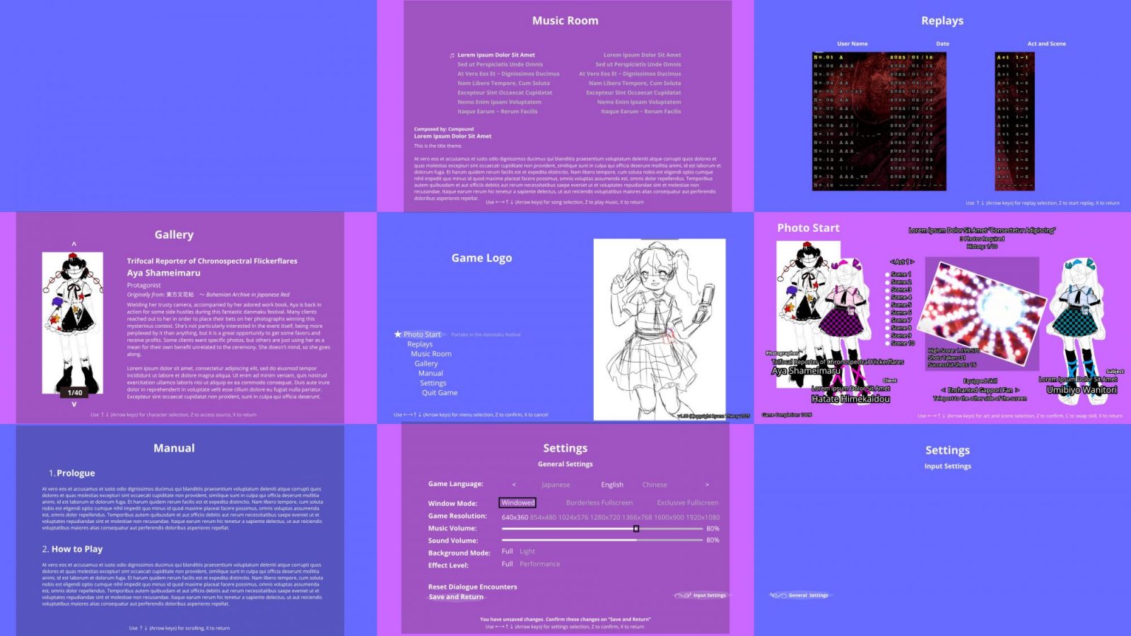
This was the first sketch of how the main menu of the game would’ve looked like. It’s very similar to the one in the final version, albeit with some radical changes in some specific areas. We (as in, me and Gertrudez, an assistant UI/UX designer on the project) made this on Canva, for curiosity’s sake. There’s a handful of key points of interest here, so let me briefly touch on them.
I believe most people will notice the different character portrait sketches here. The one in the middle, Hatate, was supposed to be her portrait in the game, but the artist (Primary) wasn’t satisfied with it, and now we have the one that’s in the final version. The Aya and Hatate portraits on the sides are sketches on how their clothes would look like in this game, so they weren’t meant to be used in the released game.
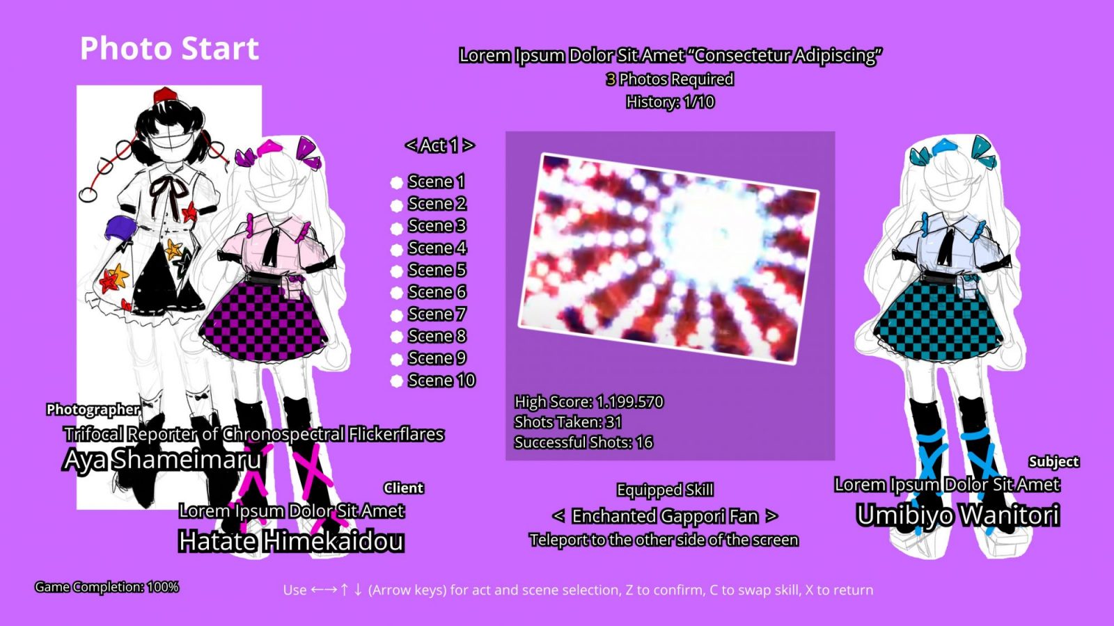
However, the act and scene selection menu is definitely the one that is the highlight of changes. As you can see, originally, following more so the menu styles of the official photography games like ダブルスポイラー ~ 東方文花帖 or 秘封ナイトメアダイアリー 〜 Violet Detector, the selectable content was all in a single screen. It’s definitely a minus one button count compared to the released version, but we felt like it was incredibly cluttered.
By separating it into two separate screens, we can give more of a highlight to specific scenes and the characters within them. It thematically feels more coherent as well, seeing as this game is a celebration of the community’s creativity, so showing the fan-made character associated with each scene felt very fitting.
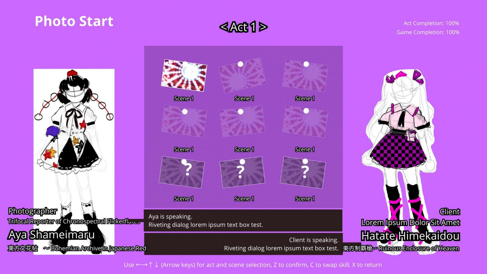
By the time this second component was sketched, we hadn’t figured out how to show them yet, so the final way we did it was pretty much directly just coding it as the ideas came, so I don’t have a sketch to show for it.
One thing to note here was that the dark backdrop here was supposed to represent a cork-board, but it felt a little off-putting near the other elements, so we kept it as floating photos.
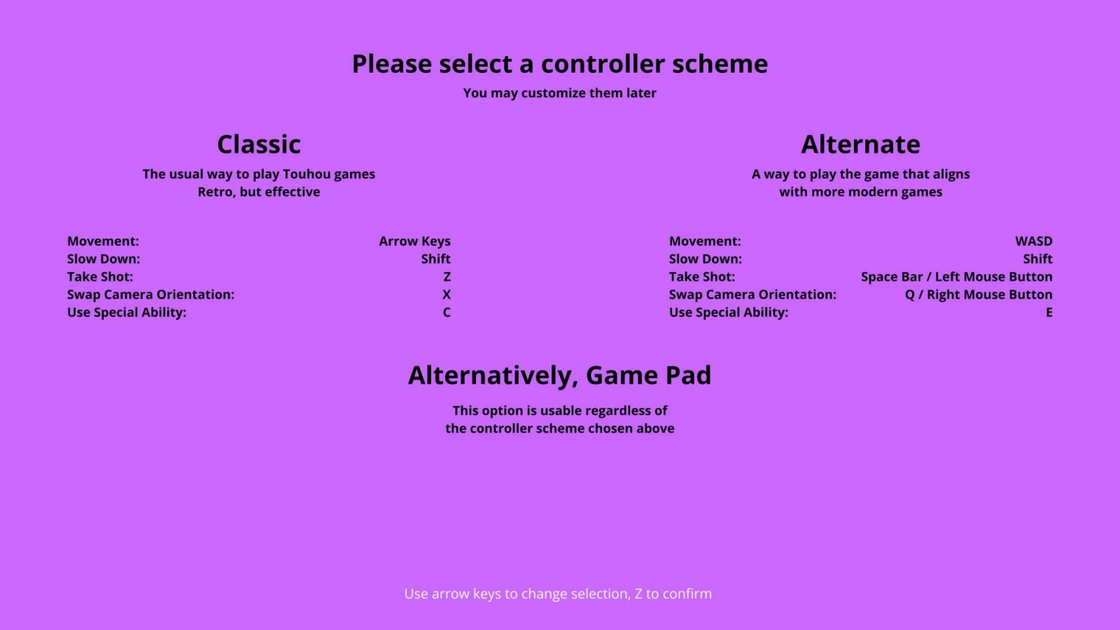
This one is a little more simple, but this was supposed to be a screen that showed up when you started the game, prompting you to select which controller scheme you’d like to use. Originally, we wanted this game to be very beginner friendly, even to those unfamiliar to the series or genre, but in the end… If you’re paying for a fangame, you probably already know the drill, and this specific type of game (photography) is already on the harder side of the franchise, so we gave up on this idea. Either way, in the end, we figured out how to permit the usage of all of these controller schemes at the same time, so this screen would’ve become useless anyway in the end.
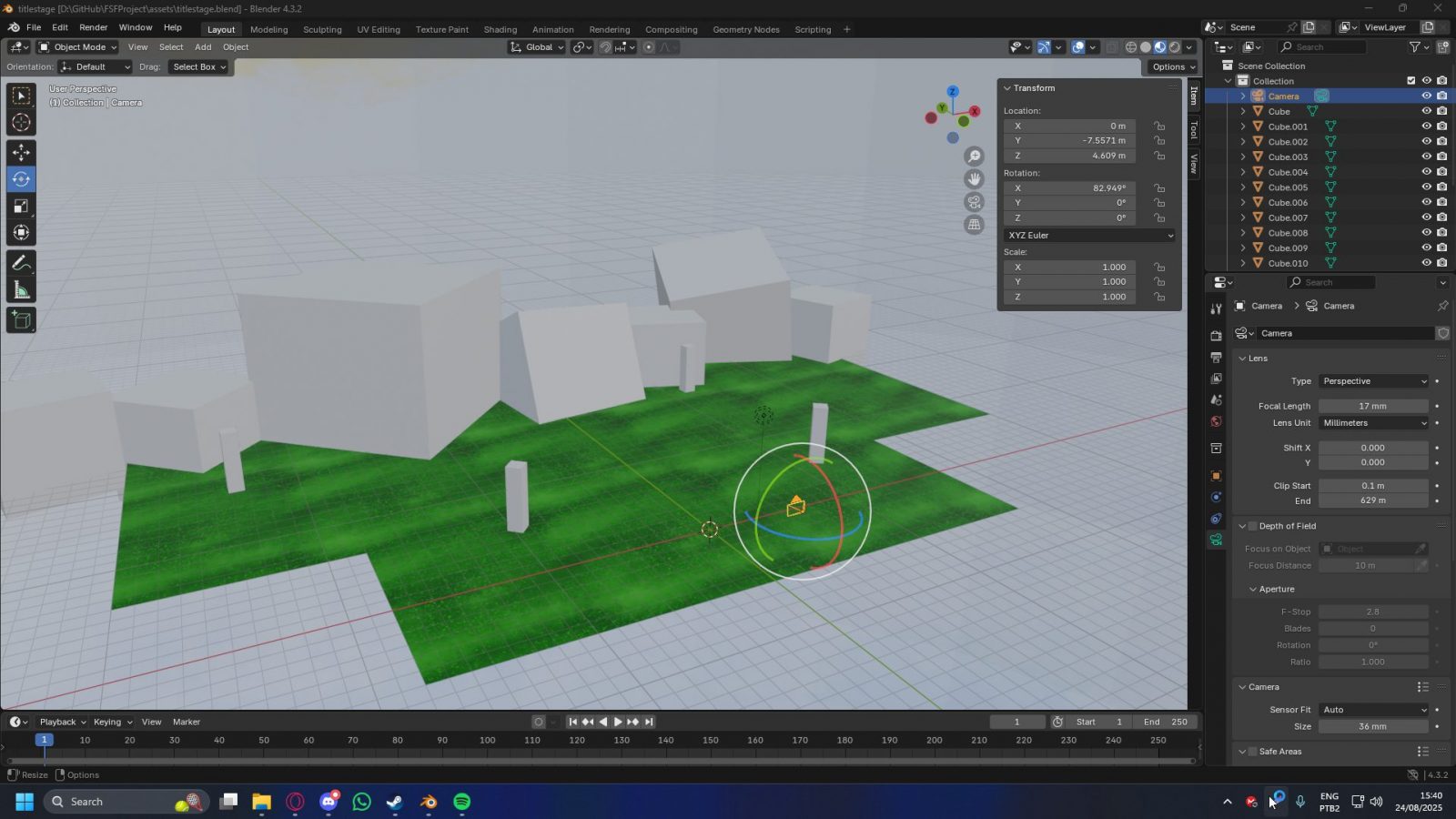
Right, this is an initial sketch of the main menu’s background. As you can see, it is vastly different from the final version. Currently, the main menu happens in a space-like scene, with a matrix-like grid scrolling and a few cubes floating around with the pictures you’ve taken during the game. Initially, I actually wanted it to have a peaceful forest scenery, but I’m not an excellent 3D modeller (for that, we had Mateus on the team, but his presence on the project only came way later into development), so I gave up on the idea.
Besides, the engine, added with my inexperience with 3D object manipulation, would’ve severely impacted the fluidity and polish of the final scene, so it wouldn’t be very pleasant, in the end. I had actually modelled a more detailed 3D scene, with trees and mountains, but I unfortunately do not have photos of that anymore.
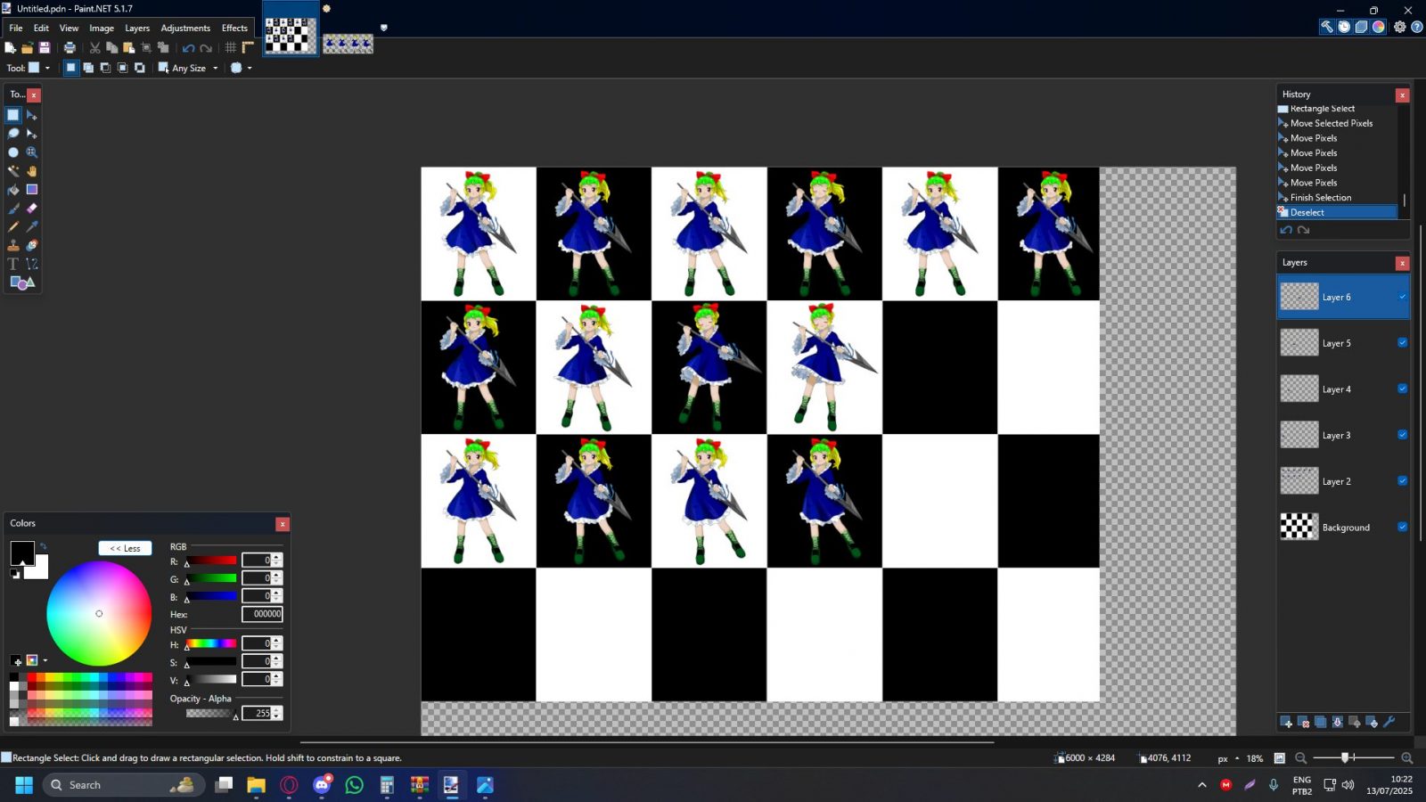
To finish off, here’s a small peek into another side of game development. Character animation. I’m extremely grateful for the amazing job Primary did with these portraits and animations, only leaving me to align and mount the sheet animation to be used in-game. I’m still fascinated by his ability to do all of that on mobile, but I couldn’t be more honoured to have such quality in a project of mine. Hopefully I can maintain this quality standard, if not better, for more cool fanworks in the future!
-Thank you once again for giving us all this insight regarding the development of the game! We look forward to your next project!
Interview with Flickerframe Shutter Festival Developers Part 2 End